One of the main factors that determines if a person will leave your website without completing the desired actions is friction. Friction is usually caused by the feeling of anxiety the user feels right before they take the next step in their evaluation. This anxiety can be related to uncertainty about the quality of your product/service, unwillingness to disclose valuable personal information, or the amount of effort required to complete an action. After your website’s homepage, forms are the second biggest point of friction for your prospects.
The general rule for website forms is that the shorter they are the better. However, most business to business companies need more than just email and name to be able to qualify and follow up with prospects effectively. In addition, if you are doing content marketing you probably want to get as much information about the lead as possible in return for the free content your are providing.
For those businesses we have assembled a list of proven techniques that will help you increase form submissions without having to sacrifices important information that you gather through the form.
The Reciprocity Principle
Time and personal information are valuable commodities which users are not willing to give away easily and can cause friction and anxiety when requested. We should consider that when we create forms for our websites. We can make it easier for users to submit valuable information by being the first to give them something valuable. In psychology this is known as the reciprocity principle and to a great way determines the way we interact with people and companies.
There are two main cases when we use forms on B2B websites and they can be grouped in terms of the purchasing stage the buyer is in:
Awareness/Research
These are the forms you use to gate your whitepapers. Since this type of content is used to attract leads that have potential for becoming customers the information that you gather from the form is critical for determining the readiness of the leads to buy and the right approach for converting them into customers later on.
There is a simple trick that can significantly reduce the anxiety and hesitation the users feel before filling out the form and downloading your resources. Place an extract from the whitepaper or an informative summary on the download page. This will help them make a better decision whether the content is valuable to them and if they want to read further.
Evaluation
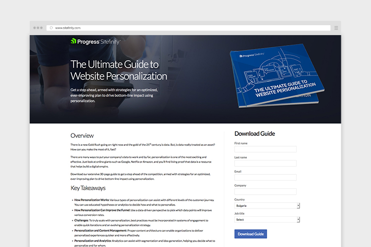
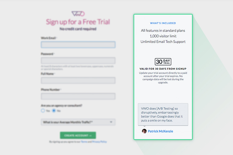
These are the people that fill out your contact us, trial, and demo forms. They fill them out when they feel that your product or services meets their initial requirements and want to learn more about how it can address their business case. Requesting a phone number or company name can cause a significant degree of anxiety as there is still a considerable level of uncertainty about your company. One of the most efficient ways to address this issue is to repeat some of the benefits customers get with your product and provide some reassurance to drive them forward. Also, consider featuring a customer testimonial or a case study next to the form. An experiment by Visual Website Optimizer found that this can increase conversion rates by up to 50% using these techniques. Here is how it looks:
Progressive Profiling
There are cases where your business processes require a significant amount of information to be gathered before the user can proceed further with the evaluation. In such cases a good approach is the so called progressive profiling. This is process of spreading the information you require from people over a few steps so that they don’t feel overwhelmed by one big form.
Let’s say the user want’s to download a whitepaper and the fields you want to gather are the following:
- Name
- Company
- Job title
- Country
- Phone
- Industry
- State
What you want to do is spread out the fields accross website visits and gather the information incrementally.
So when users download a whitepaper from your website for the first time you require from them to fill out fields 1-4.
During their next website visit when they try to download another whitepaper, instead of asking them for the same fields you show them fields 5-8. When they fill them out you just augment the initial contact record that you have created.
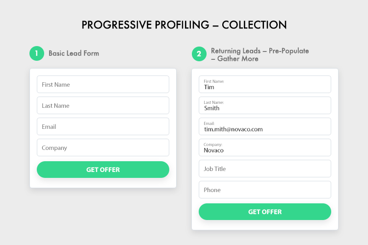
This approach requires some technical development, however there are ready solutions on the market, like Unbounce and Hubspot that offer this functionality out of the box.
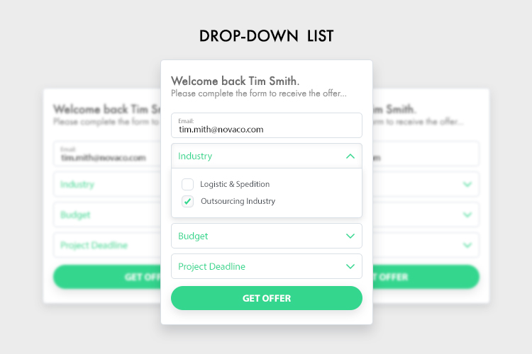
Use drop-down list instead of open text where possible
This one seems obvious but many people don’t realize how many open text fields can actually be turned into a drop down lists. Open text is good for capturing qualitative data but when it comes to forms it can significantly increase the time needed to fill out the form.
The trick is to survey your current client base and website visitors to determine which are the options that should be provided in the drop down. A good way for doing this is the Poll functionality of Hotjar.
After gathering the data, clean it up, group it into several options, and include them in the drop down.
Here are some fields that can be formatted using this approach:
- Job title
- Industry
- Company
- Budget
- Project timeframe
Something important to remember is to always provide “Other” option. If at some point this becomes the prevailing answer it will be a signal that you need to reevaluate the profile of your customers.
These are some of the approaches that can help you make the customer journey on your website smoother and improve your conversions. For further reading on conversion rate best practices I recommend visiting the resource sections of ConversionXL and Unbounce.