
Client
Sqilline is a consulting and mobile application development company which provides implementation services of different SAP Solutions. In addition to their official partnership with the german software company SAP, they are also developing their own mobile solutions, which are based on the different SAP Platforms. After its establishment in 2009, the company has grown greatly and has become the first official SAP Mobility Partner in Easter Europe.
Challenge
With the years Sqilline has shifted their focus from being just a custom development shop to offering prepackaged software. As a result, they needed a new website, where to highlight their own products alongside their development services. The client also wanted to reposition itself and to focus the website on the healthcare industry, as most of their solutions are used in it.
Discovery
Before starting the redesign project, our Creative, Marketing and UX Teams sat down with Sqilline to identify and define the company’s needs, and understand more about their customers.
During this stage we also laid out the foundation for the sites information architecture by defining a draft site structure.

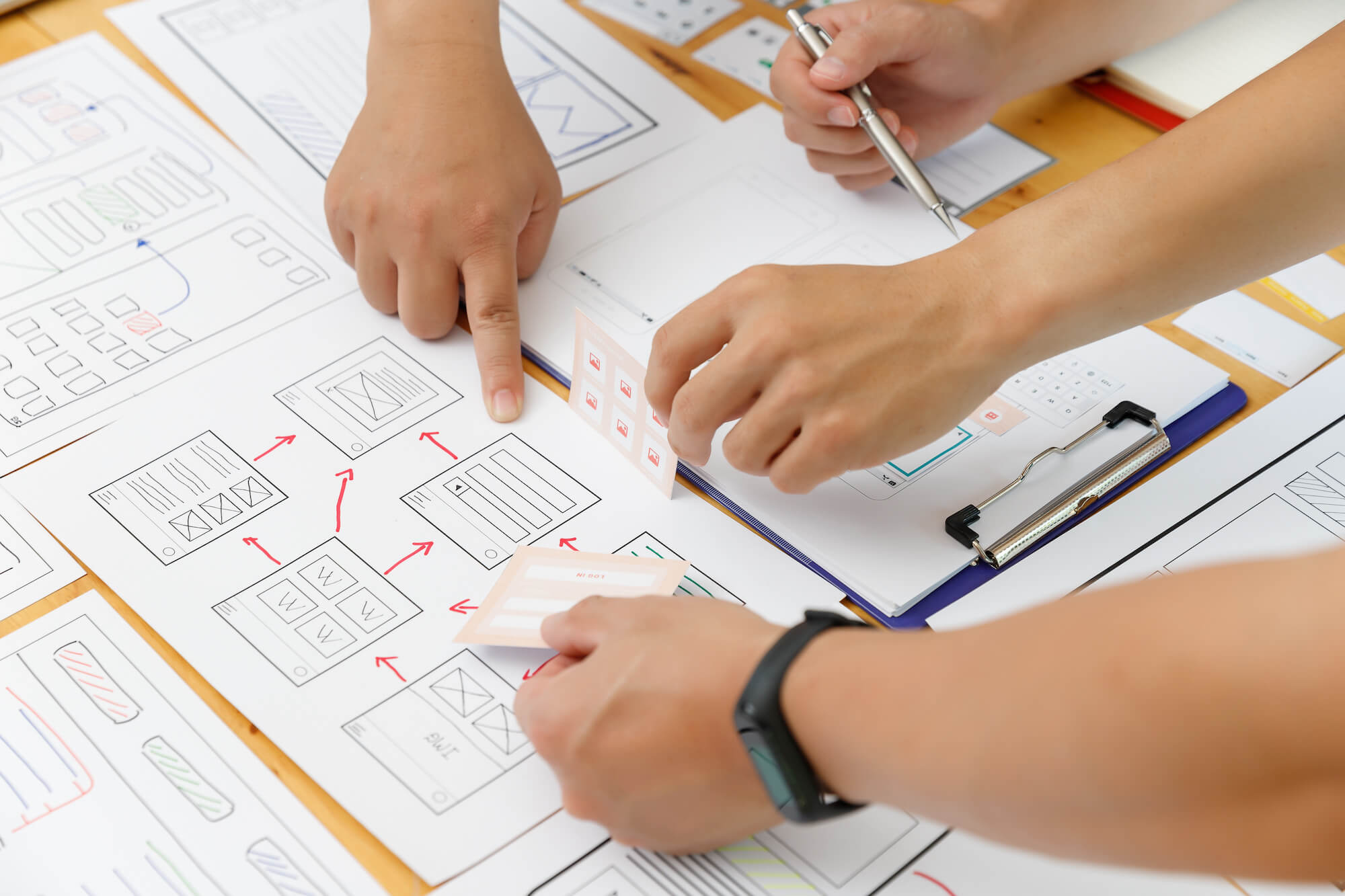
Wireframes
When you make a redesign project, you are reorganizing the whole content and information which you want to provide to the visitors of the website. In order to ensure a smooth user experience, we concentrated on clear “call-to-action” sections on each page, intuitive main navigation and easily-scannable content. However, such a big change can’t be done without prototyping and testing it first. We’ve spent several weeks working closely with the client to clear out all the elements on each page, and also to optimize the user flows so that the website guides the users through the pages in a convenient way.

Wireframing the responsive design before starting the actual visual design helps to communicate ideas with the client, before spending any time doing UI design work.
Our past experience has taught us that when trying to deliver a great responsive design, it’s great to start thinking about how the design will adapt to each screen resolution in the early stages of the design. This is why we wireframed all of the pages in 3 breakpoints – for desktop, tablet, and smartphone. After that, we optimized the website for each screen by reducing or reordering the content on each page.
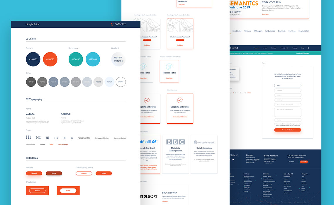
Visual Design
During the competitive analysis, our team took time to examine the visual style of the websites of Sqilline’s competitors and the technology sector in general. As a result, we decided to create a UI design that resembles Google’s material design.
One of the main goals of Sqilline was to showcase their own products, but at the same time show those products in the context of the industries that can benefit from them. This is why we’ve created a visual navigation, that puts an accent on each individual industry. We also used a lot of photos, which are close to the healthcare industry, in order to create the look and feel the company was aiming for.

Conversion Rate Optimization
Another major goal was to decrease the time needed to contact the Sqilline team and request a demo of their products. That’s why each product page has it own form at the bottom of the page, and a sticky footer is always available in the page if you want to quickly jump to the form.

“Request a demo” call-to-action in sticky footer on the tablet, and a form in the Products page on the laptop.