Unifly is the world leader in Unmanned Traffic Management (UTM) and drone fleet management developing an aviation software which helps map out and control the airspace used by drones. Their cloud-based platform enables the safe integration of drone traffic in the very-low-level airspace and tells drone pilots & operators where it is safe and legal to fly.
Аs the usage of drones globally dramatically increased over the past few years, and since Unifly is one of the front-runners offering aviation software for airspace control, they needed to polish their brand and proudly fill in the shoes of the Innovators in this new market segment. Their current brand logo had to better reflect their high-tech nature and a master guideline document had to be created, to ensure the consistency of their branding and further boost their brand awareness.
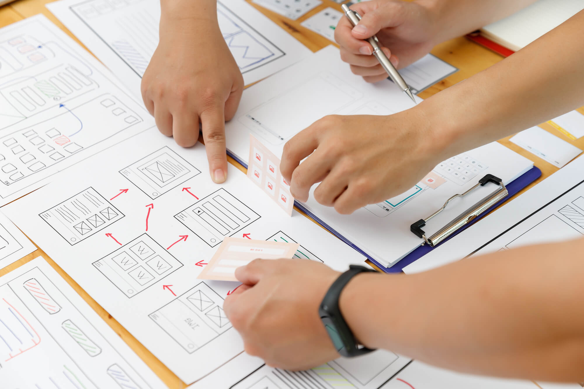
It all started with research and creative workshops
First, we needed to gather all the specific and abstract details that formed the personality of the brand, to make sure our creatives have enough clues that will guide them to the creative direction that will ring true with the client and it’s customers. After analyzing the information provided by Unifly and doing our own desk research on the industry, we prepared a mood board that explores several directions that can be taken. We then held a workshop to review the mood board and define what types of visual elements should be included in the branding, and what is the overall look and feel that we want to convey. As a result, we identified the main type of brand elements and decided that two of the colors used in the existing branding can be kept, but the rest should be changed to make the end product more consistent.
We moved on to improving the Corporate branding
Once we had a clear direction and clear pain points to address, it was time to get it all on paper and screens. During the sketching our branding experts were able to polish the shapes of the logomark and improve the typography of the wordmark. The perfect proportion between separate elements had to be found, as the geometry of the current ones was not consistent. In addition, since Unifly wanted to treat their products as sub brands, we decided to use the same logomark throughout their product portfolio but change the logotypes accordingly. We included in our approach a technique called color coding that allowed us to further distinguish between products, while in the same time contributing to the overall brand awareness.
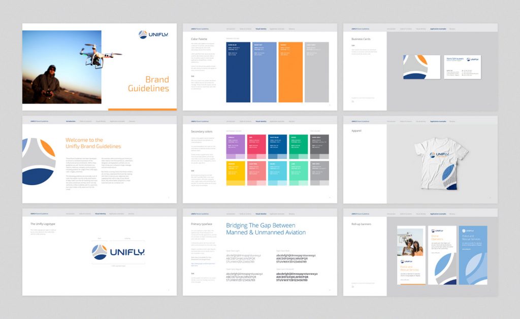
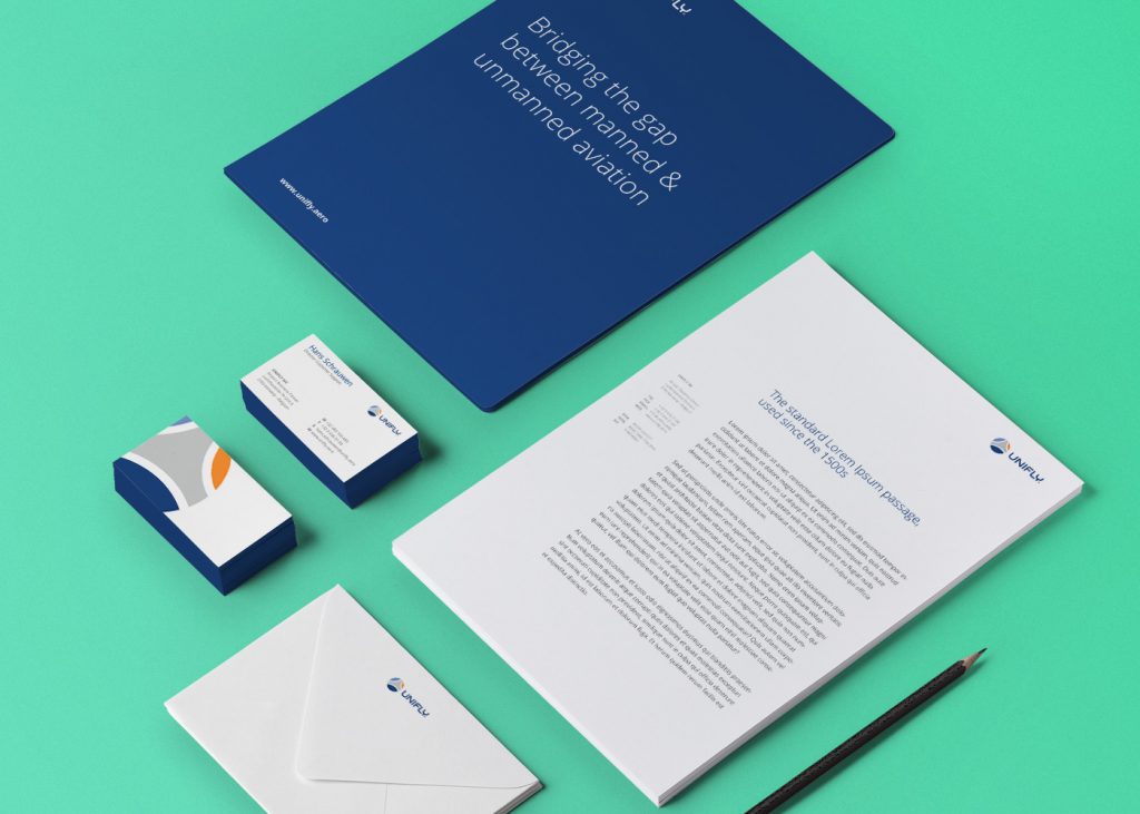
All the work was captured in a corporate Brand book
Once the foundation of the refreshed brand was in place, we had to ensure its ongoing consistency by creating a Brand Book. Additional typography and supporting graphics were carefully designed to provide a pleasant experience without sacrificing any of the primary elements. With that guide in hand, our designers were able to create stationary materials that support the marketing initiatives and day-to-day operations of the company, and reflect the value and promises of the brand with confidence and consistency.